Salesync Settings.
How I turned a 30-block legacy scroll — where one click could rewrite a customer contract — into an admin hub people actually trust. Independent 2026 concept work post-Coditas.
Client
Salesync
Role
Product Designer (sole designer on this surface)
Surface
Web · Enterprise · Admin Console
Process
- Audit
- Information Architecture
- Interaction Design
- Accessibility
- Design System
- Validation
The arc · Point A → Point B
A — Where it started
A 30-block vertical scroll. No search. Implicit saves. Deprecated toggles next to load-bearing ones. One misclick could silently rewrite a signed customer contract.
B — Where it landed
A hub-and-spoke admin console. ⌘K targeting in under 2 seconds. Dependency-review modals before every cascading save. WCAG 2.2 AA across every token pair. Built to survive the next decade of accretion.
What it moved
The numbers, in plain sight.
142
Settings audited & rationalized
30 → 8
Navigation compression
≤ 2s
Time-to-target (⌘K)
100% AA · 75% AAA
WCAG 2.2 conformance
The story · 7 chapters
How Salesync went from point A to point B.
The Brief
Make the unsurvivable, survivable.
❝When I joined the project, Salesync's company administration page had been growing by accretion for a decade. 142 settings. 30 vertical blocks. No search. No grouping logic that mapped to how admins actually worked.
The real problem wasn't ugliness — it was risk. Deprecated toggles sat directly next to active, load-bearing configurations. Saves were implicit. A single click could cascade across billing, permissions, and integrations, silently rewriting a signed customer contract before anyone noticed.
The brief from the CEO was one sentence: stop the silent breakages and make this page survivable for the people who use it 40 hours a week.
Pull-out · The Brief
30 blocks
V1 vertical scroll, zero search
The Audit
Designing by deletion.
❝Before a single frame, I had to stop the bleeding. I exported the entire V1 page as one continuous screenshot and annotated every setting in red and green: keep, deprecate, hide, or move.
That single artifact replaced a 30-question stakeholder doc. Two executive sponsors, the eng lead, and the CS lead all aligned in two meetings. We deprecated or hid 13 legacy settings outright — shrinking the design surface by ~9% before architecture work even started.
The lesson: alignment is a design problem. The right artifact moves more weight than the right meeting.
Pull-out · The Audit
13 settings
Cut before a single frame was drawn
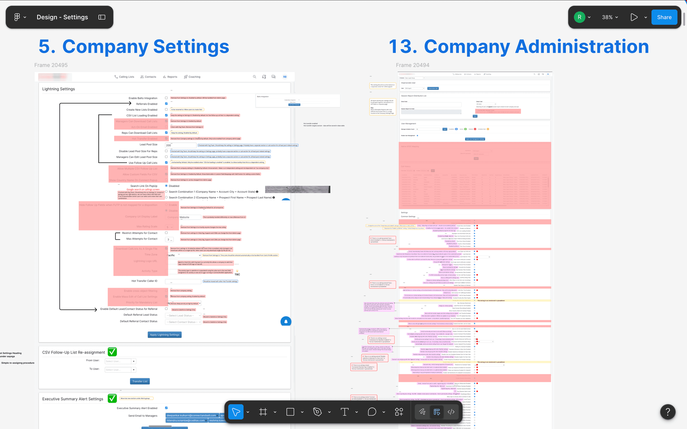
Annotated V1 audit — Company Settings and Company Administration exported as continuous screenshots, with every block marked keep / deprecate / hide / move; this artifact replaced a 30-question stakeholder doc.
Information Architecture
Thinking in tasks, not systems.
❝My first redesign attempt introduced a sidebar — but kept the old mental model, organizing 16 flat items by the technical backend that produced them. Cleaner, yes. Survivable, no.
I ran an open card sort with 2 Salesync admins. The pattern emerged within the first session: admins don't think in subsystems. They think in task frequency — 'things I do every Monday' vs. 'things I touch once a quarter'.
We collapsed 16 technical buckets into 8 task-oriented categories. That number wasn't arbitrary — it sits inside the 7±2 working-memory budget, which means an admin can hold the whole map in their head while they work.
Pull-out · Information Architecture
30 → 8
Technical buckets → task categories
V2 dispositions — sidebar groups settings by subsystem (CRM, SFDC, List, Alerts); a cleaner shell, but still organized by the backend that produced each row.
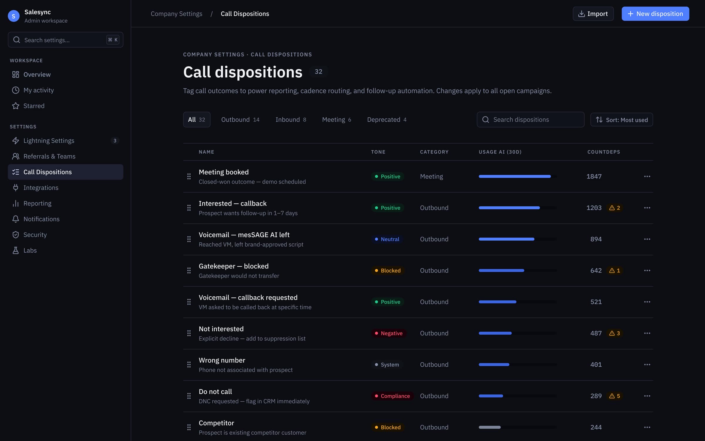
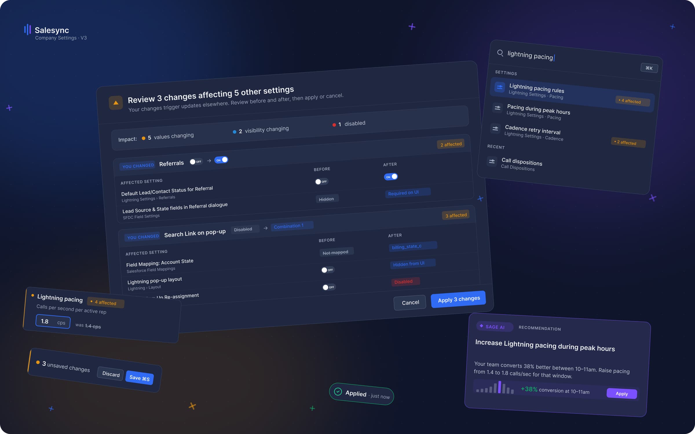
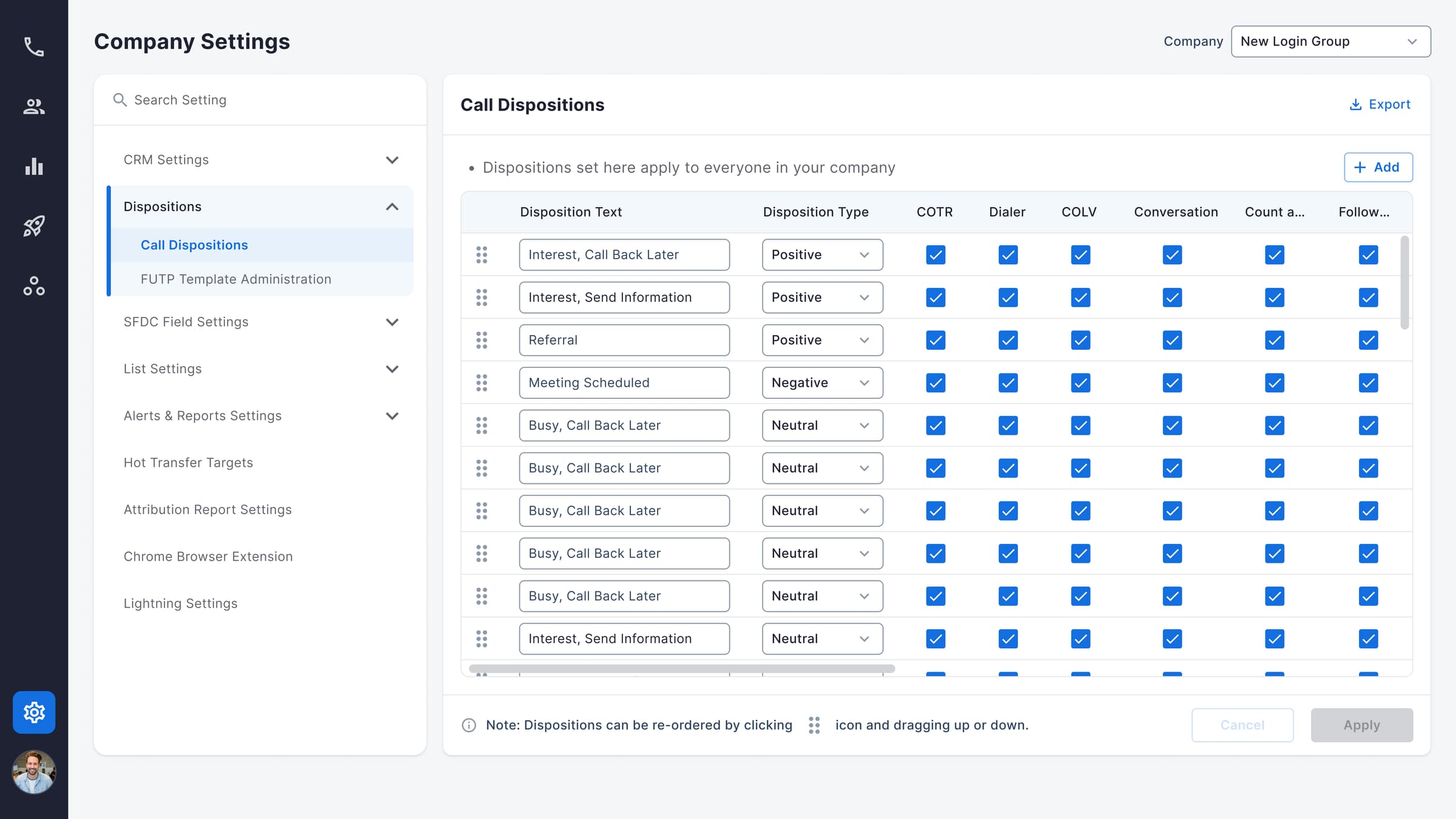
V3 dispositions — task-based tabs (Outbound · Inbound · Meeting · Deprecated) plus 30-day usage bars and dependency-affected counts, so admins triage with signal instead of guesswork.
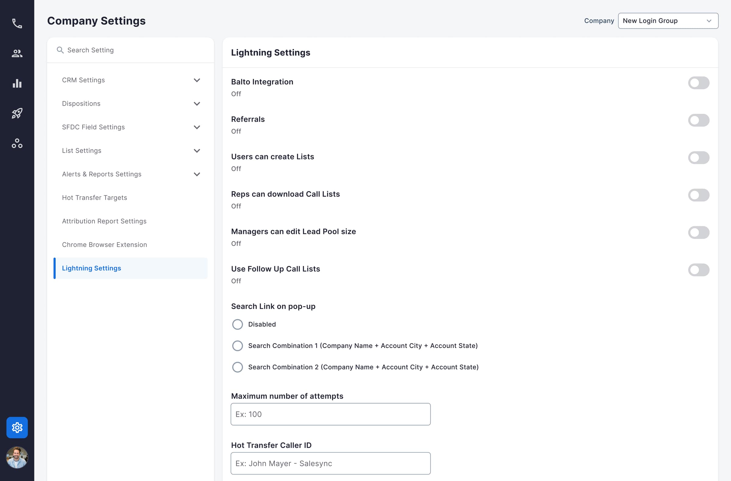
V2 Lightning Settings — toggles rendered as an undifferentiated stack, with no hint that flipping one cascades into others.
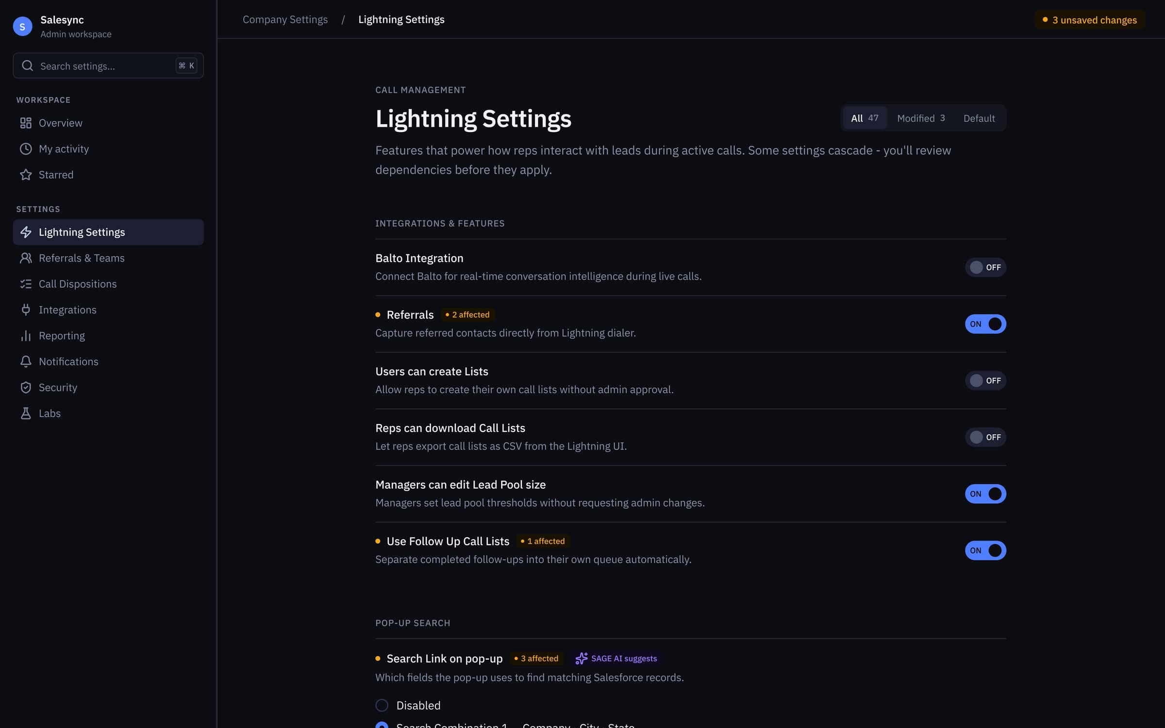
V3 Lightning Settings — every dependent toggle wears an ‘N affected’ chip, SAGE AI surfaces context-aware suggestions, and unsaved changes are counted in the header.
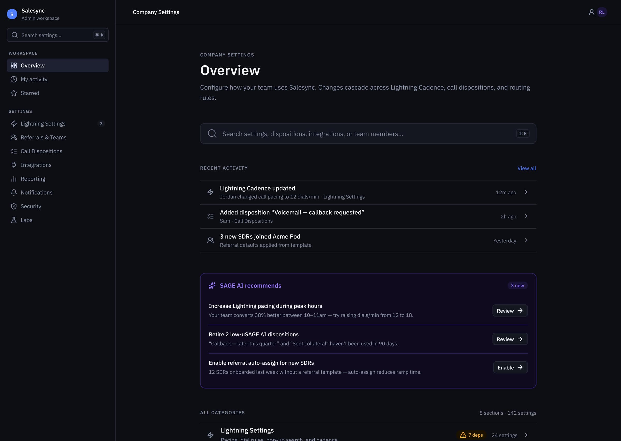
V3 Overview hub — global ⌘K search, recent activity feed, and a SAGE AI recommendations panel framing the 8 task categories / 142 settings sitting underneath.
Interaction Design
Patterns that carry the weight.
❝Two patterns do the heaviest lifting in V3. First: a global ⌘K command palette. It collapses the time-to-target from 8–22 seconds of scroll-and-scan to under 2 seconds of typed intent. Power admins never touch the sidebar.
Second: dependency-aware save modals. When an edit cascades — say, a permission change that affects billing logic — the save is intercepted and a modal shows a before/after diff with the full list of affected entities. Paired with a persistent unsaved-state floating bar, the UI itself becomes the form's visual memory.
Together, these turned 'one wrong click rewrites a contract' into 'every consequential save is reviewed before commit'.
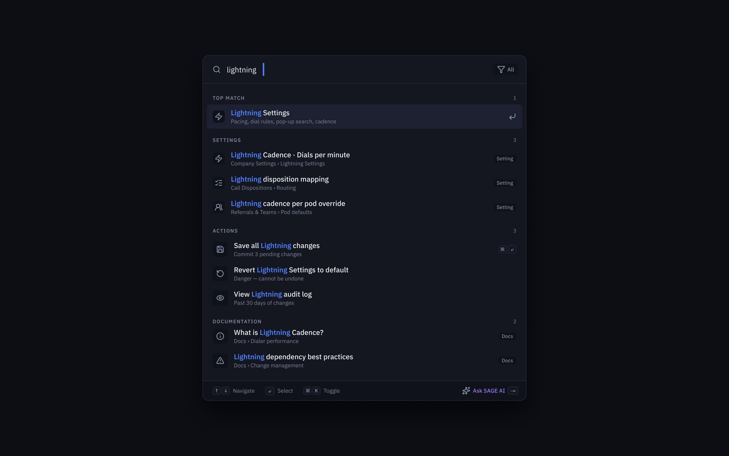
⌘K command palette — typed intent collapses 8–22s of scroll-and-scan into under 2s, with grouped results across Settings, Actions, and Documentation plus an ‘Ask SAGE AI’ fallback.
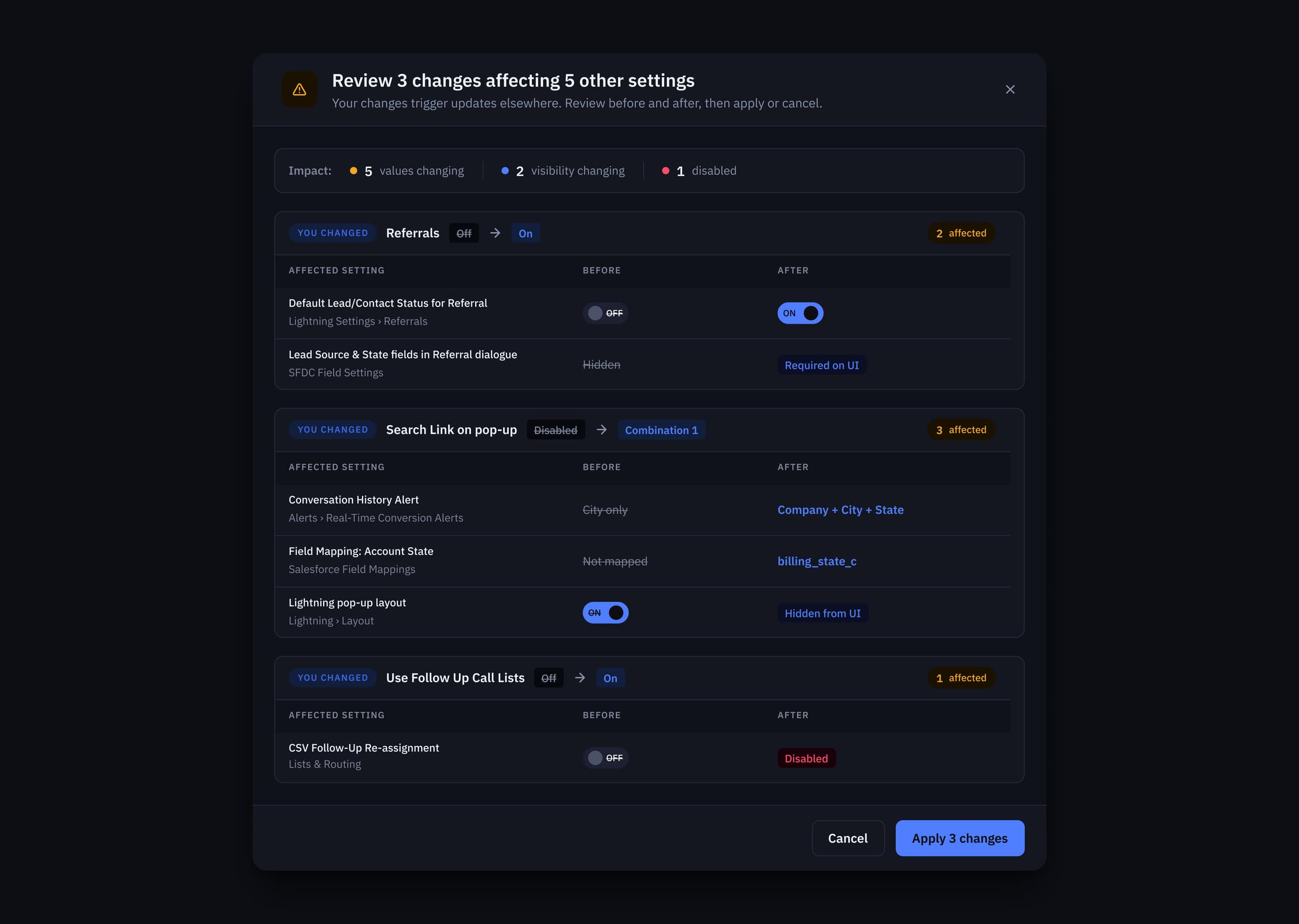
Dependency-review modal — every cascading save is intercepted with an impact summary (values changing, visibility changing, disabled) and a before/after diff on each affected setting before commit.
Accessibility
A constraint, not a cleanup pass.
❝Accessibility was baked into the tokens from day one — not bolted on at the end. In V1, helper text used a neutral that hit just 2.54:1 contrast against the dark canvas. That's not 'borderline'. That's a hard fail, on the text that explains what every setting actually does.
I raised a single primitive (neutral/200) by two stops. Because every semantic token derived from it, the fix cascaded through the entire system in one PR. Every text-on-background pair now meets WCAG 2.2 AA. Six of eight pairs hit AAA. Primary text landed at 14.8:1 — well past the 7:1 AAA threshold.
Accessibility done at the token layer is cheap. Done at the component layer, it's a cleanup pass that never finishes.
Pull-out · Accessibility
14.8:1
Primary text — AAA, 2× the threshold
Design System
Built for the next decade of accretion.
❝The original page didn't fail because the designer was bad. It failed because no system held it together — every setting was a one-off. So V3 doesn't ship as a page; it ships as a contract.
Eight section primitives. Three modal patterns. A single token surface. Every new setting an engineer adds in 2027 will inherit the contrast, spacing, and dependency-review behavior automatically. The page will get bigger. It won't get worse.
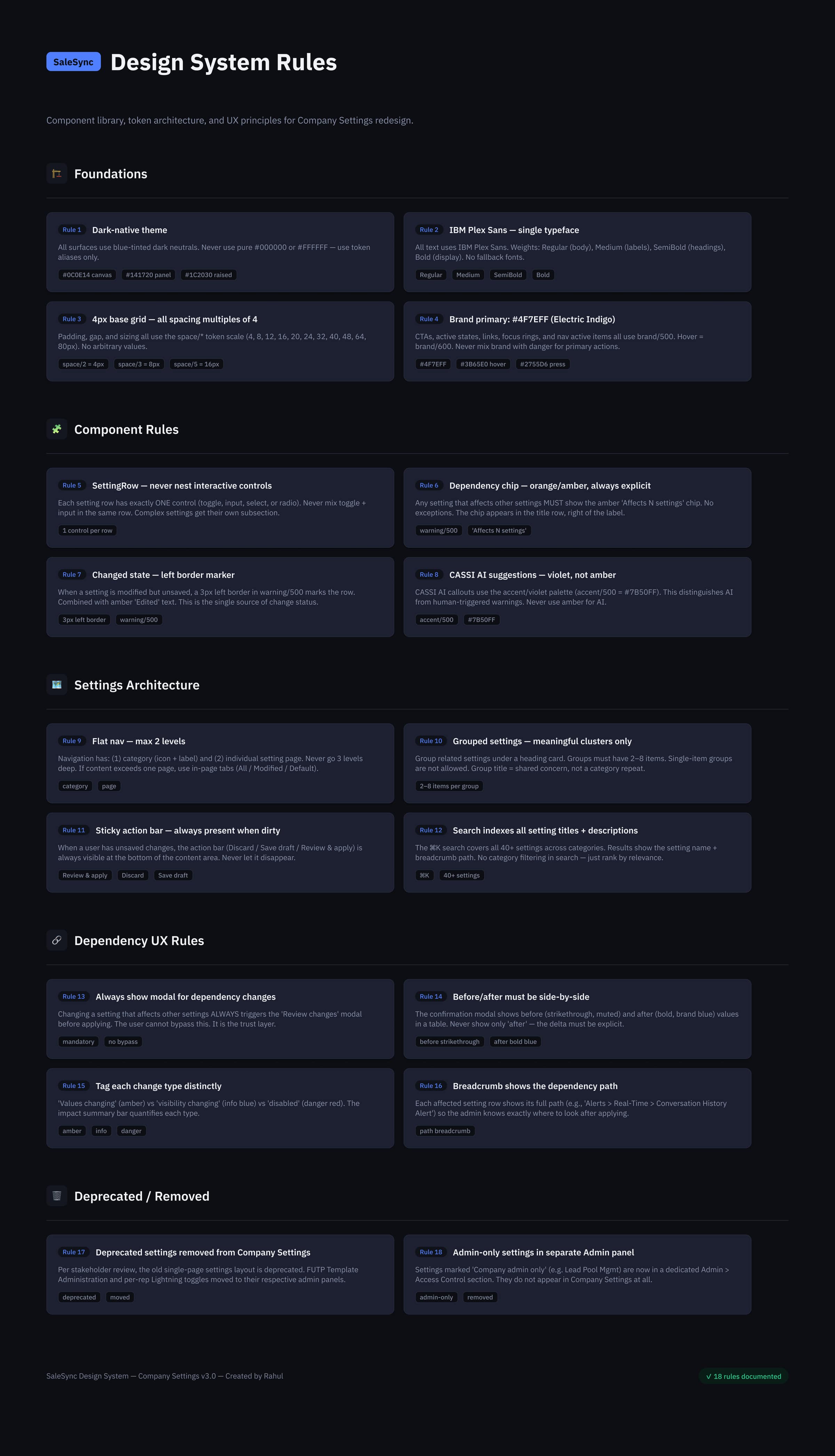
The Settings design-system contract — Foundations, Component Rules, Settings Architecture, Dependency UX Rules, and a Deprecated/Removed registry, so every setting added in 2027 inherits the page's behavior automatically.
Outcome
What 8 weeks bought.
❝Eight weeks for a settings page sounds generous until you remember every row was load-bearing on a customer contract. The work shipped on time, in three versions, with zero rollbacks.
SAGE — the AI recommendations layer — lives directly on the overview, in a dedicated violet token so it can never be confused with a system warning. It orients admins at the moment of intent, without interrupting the moment of action.
What I'm proudest of: the page is now boring. Admins stopped writing tickets about it. That's the goal.
Pull-out · Outcome
0 rollbacks
3 versions shipped on time
05. 142 settings → 8 task-based categories. ⌘K targeting in under 2s. WCAG 2.2 AA across every surface. Zero silent contract breakages.
Want this kind of work on your team?